


SAFA
The identity for the SAFA confectionery chain in Baku was developed taking into account the basic principles of the company - quality, style and minimalism. The name SAFA was chosen from the first letters of the family members of the company's founder, which emphasizes the family nature of the brand.
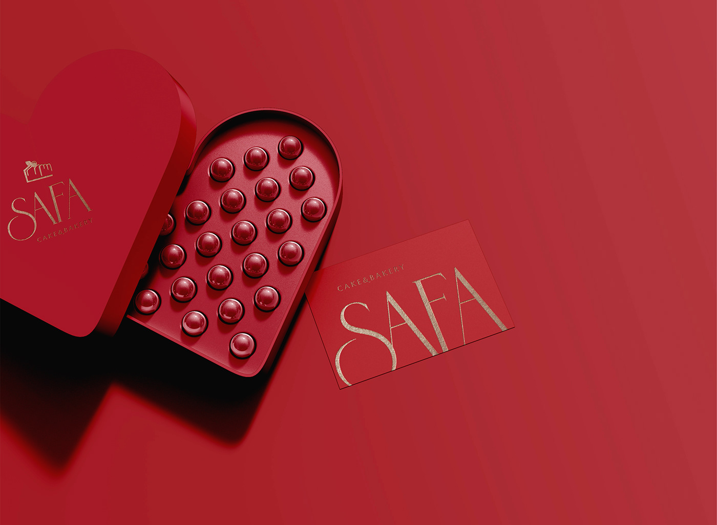
The corporate identity was developed in red and gold tones, which symbolizes luxury and high quality products. The colors were chosen in such a way that they attract attention and create associations with confectionery products.
The logo was created in a minimalist style. It is a stylish, laconic font combined with a minimalistic cake sign. This sign symbolizes the company's products and is its main element.
SAFA's identity was designed to attract customers' attention and create a recognizable brand image. It was successfully implemented into all elements of the company’s corporate identity, including product packaging, advertising materials and confectionery interiors.
Designer: Tamara Elisina
inst: @tommimell.des


